Shooting My Shot: Review of LomoChrome Purple
Stumbles and Fumbles in Photography

Last week, when I posted my beginner’s review of LomoChrome Turquoise, I teased that I would also talk about my experience with LomoChrome Purple. Well, here it is.
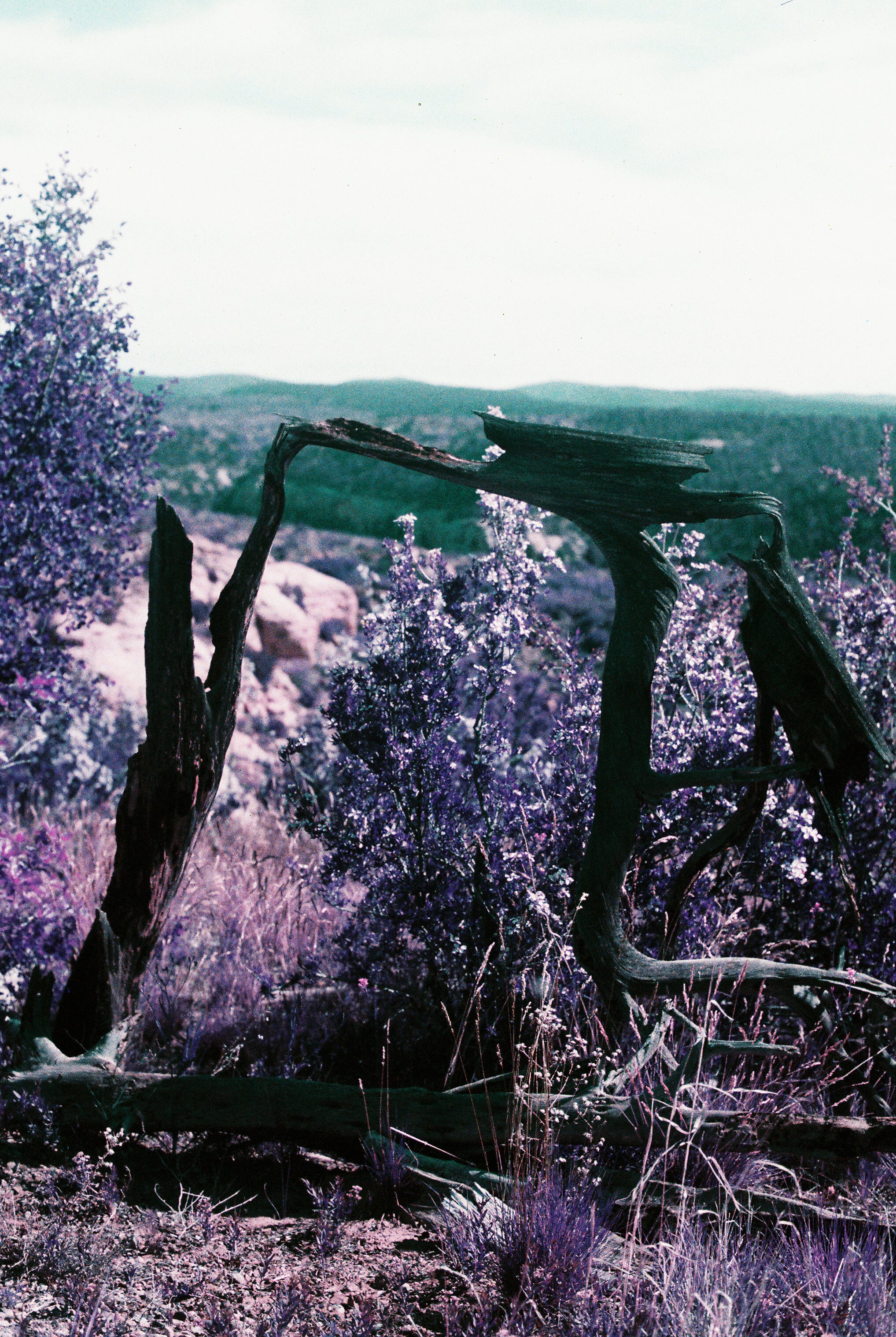
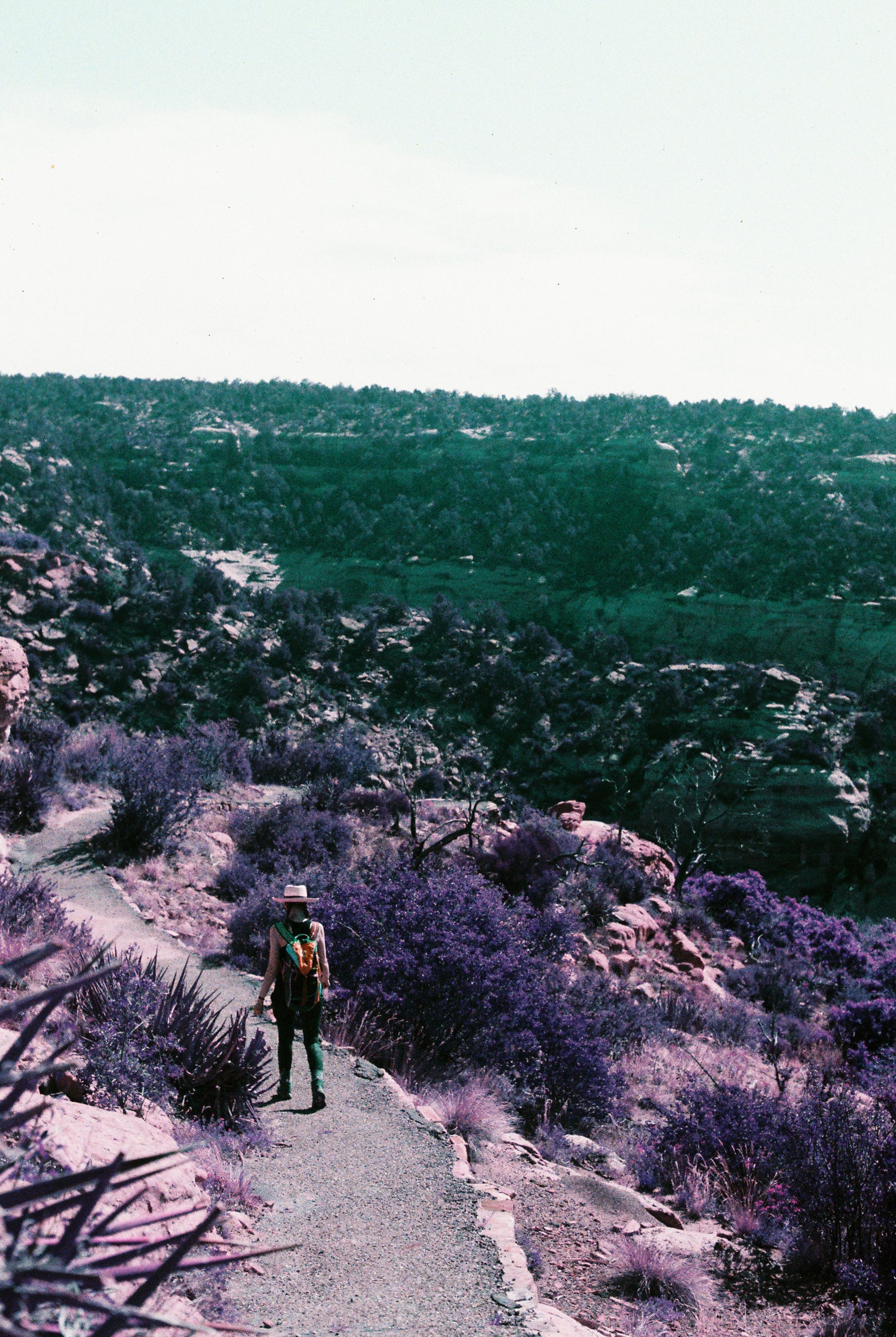
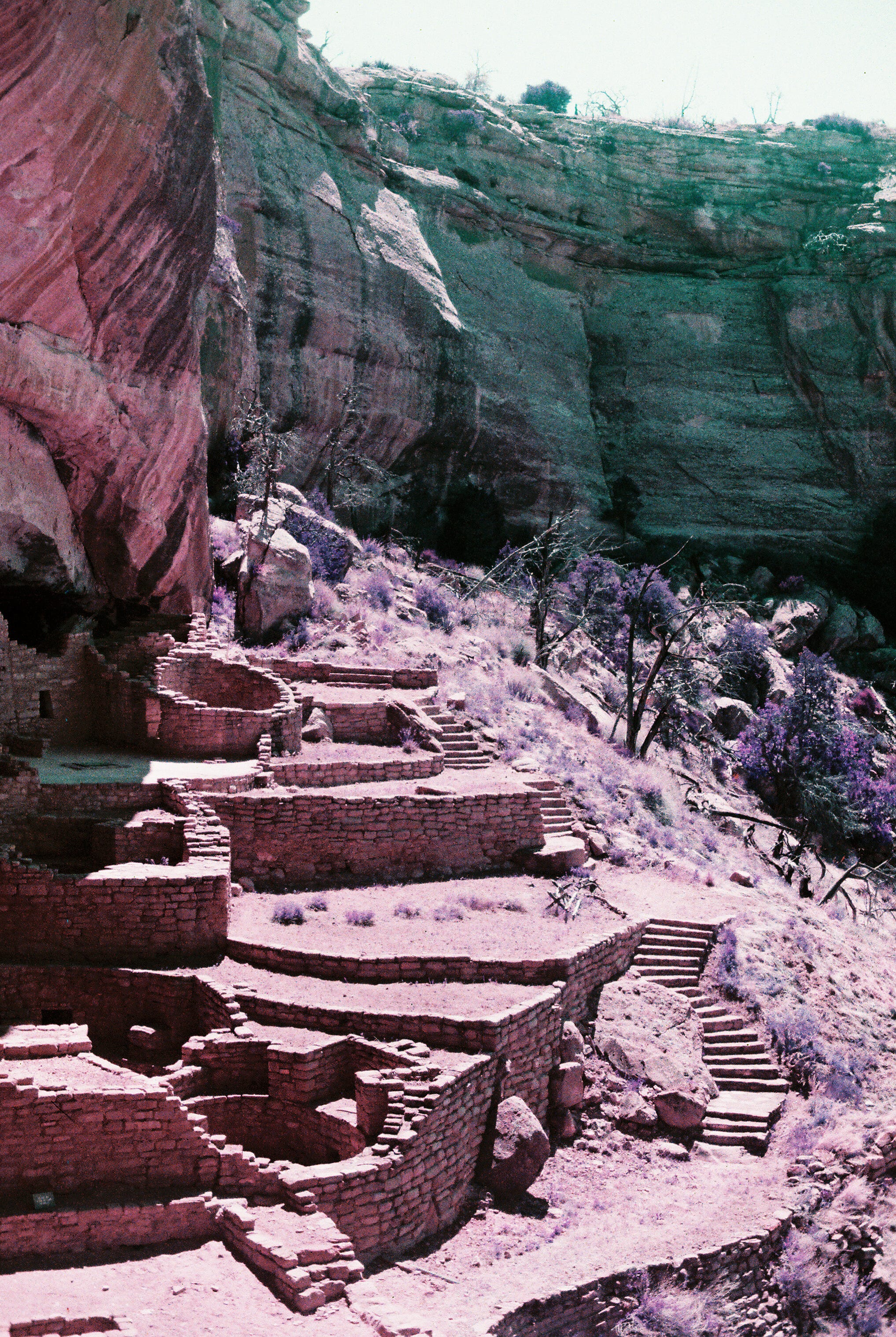
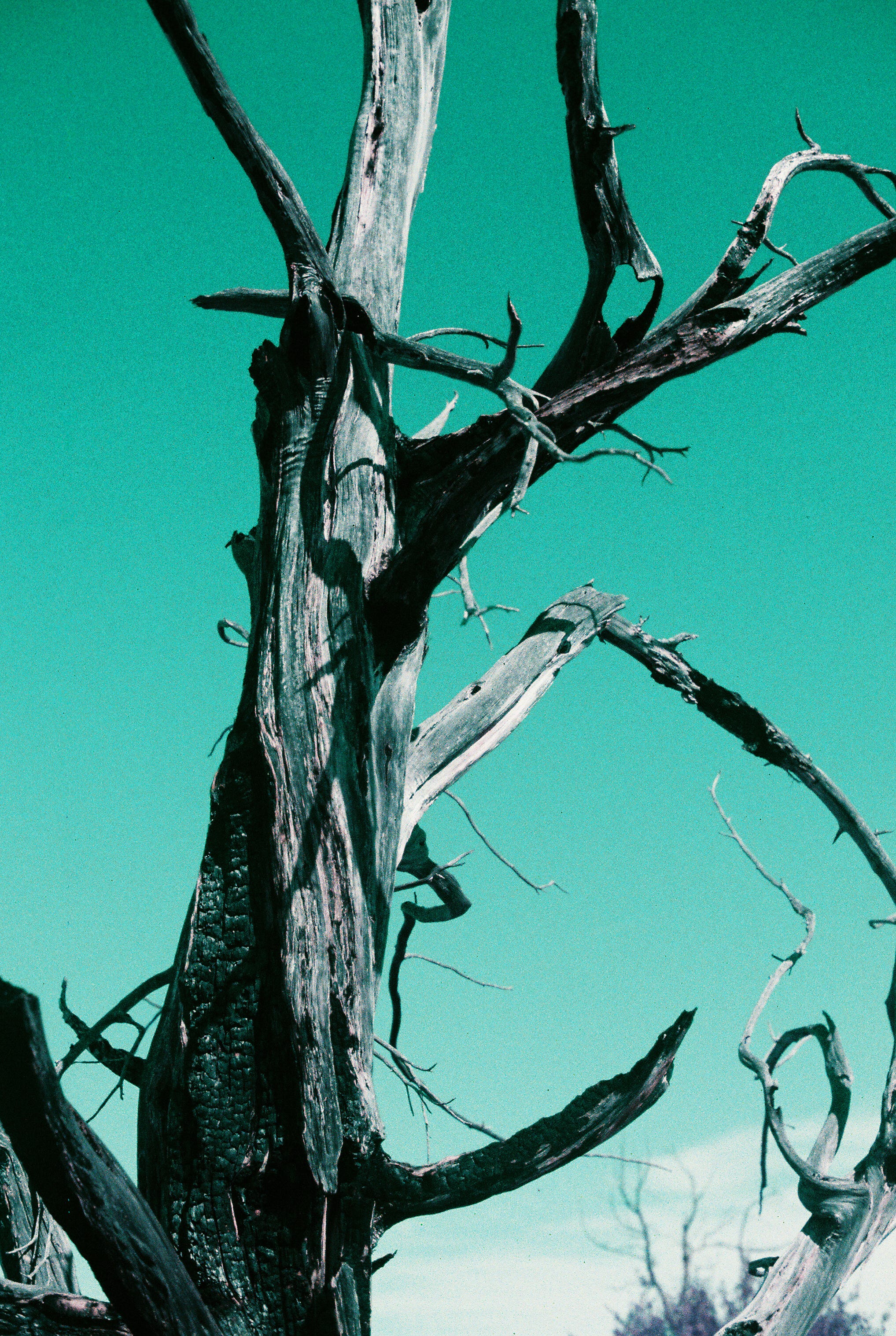
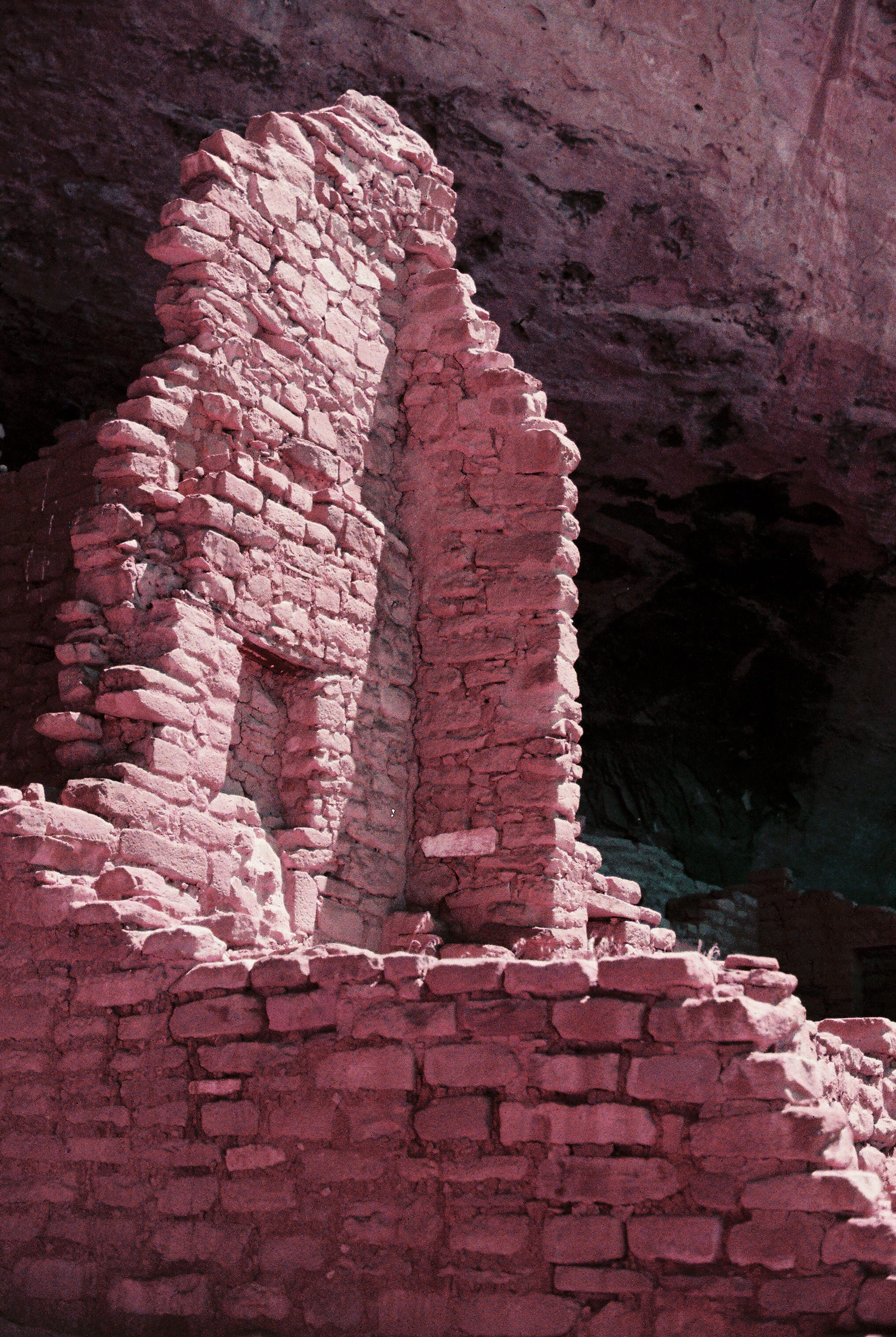
After reading up on it, I thought it would be a good one out in the wild Southwest. This variable speed (100-400 ISO) film stock turns “blue into green, green into purple, and yellow into pink, while red tones remain unchanged.” Turquoise seemed a good fit for Arches, so maybe Purple would be cool among the ancient ruins of Mesa Verde.
I shot this film with the same camera, lens, and ISO setting as I did with the other Lomography film: Canon AE-1 Program, 50mm lens, ISO 160.
What did I think of the results?
I liked it, overall. More than the LomoChrome Turquoise. The shift from blue to gold makes for a pretty uncanny sky, but the shift from blue to green with LomoChrome Purple makes for a more appealing baseline for outdoor shots.
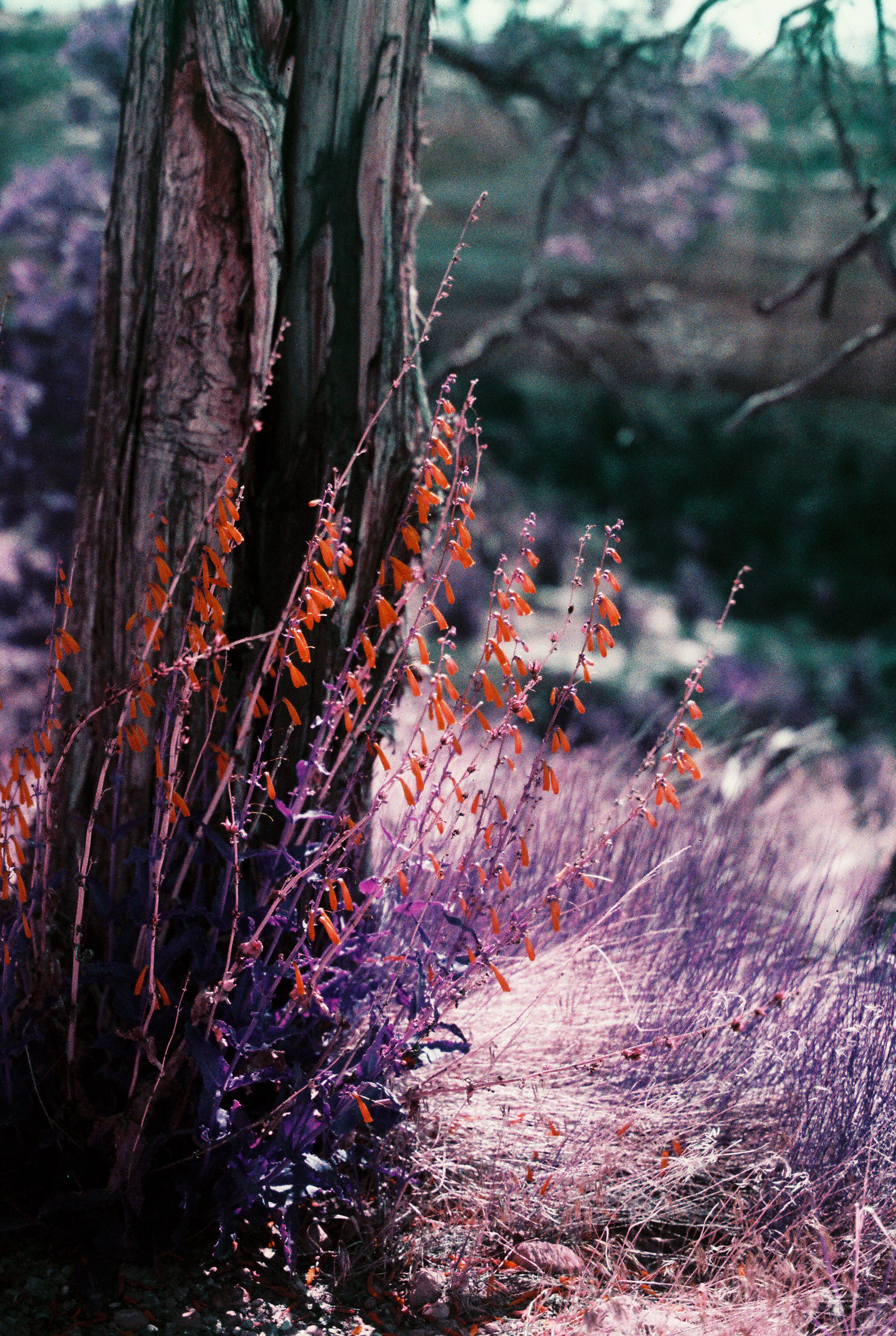
The purples and pinks that I got were much more muted than those I saw in other reviews of this film stock. My photos ended up very pastel. I think that may have something to do with metering it at 160. Perhaps it would be more vibrant on the 400 end.
What I liked specifically:
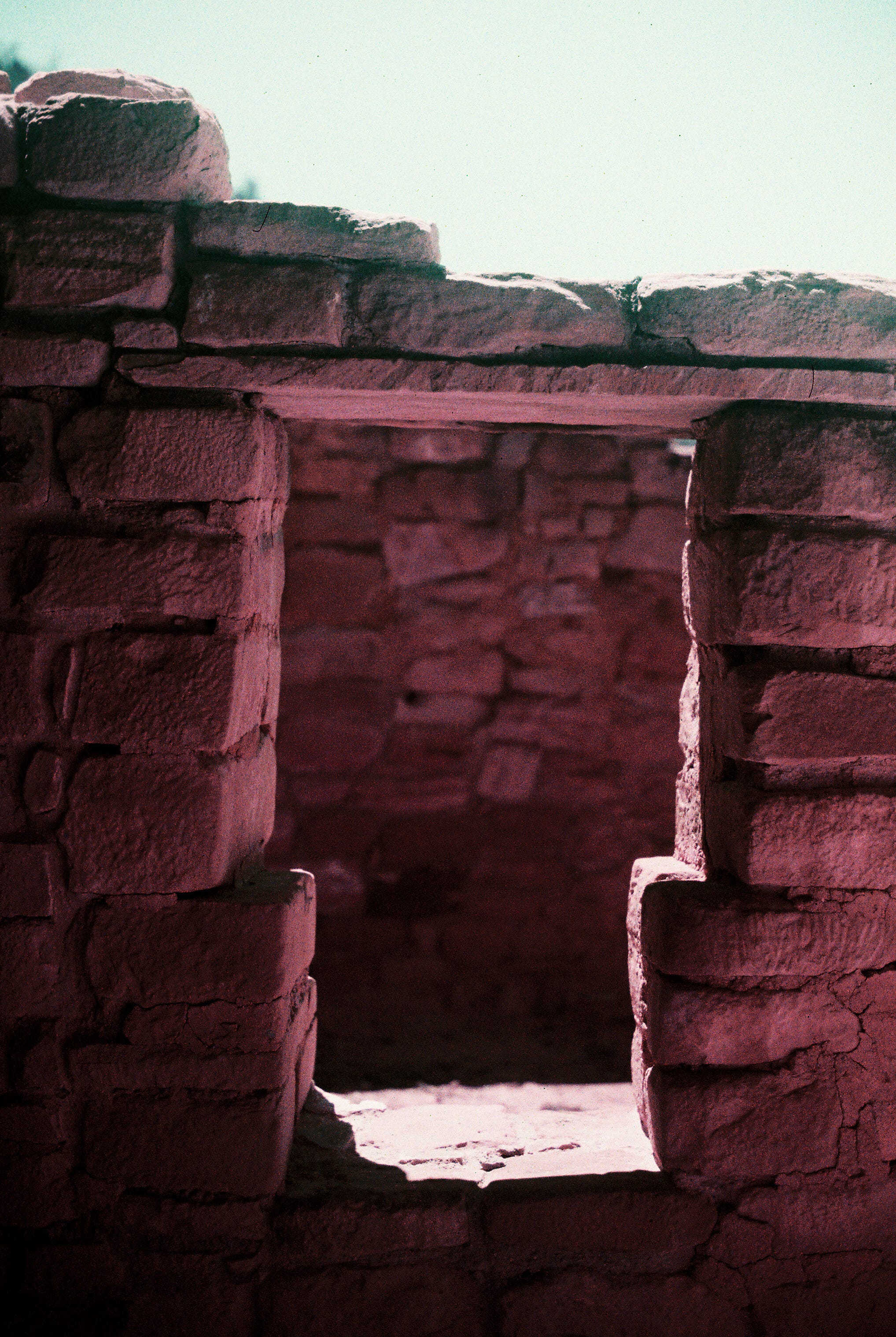
Southwest architecture looks pretty cool with this muted color shift.
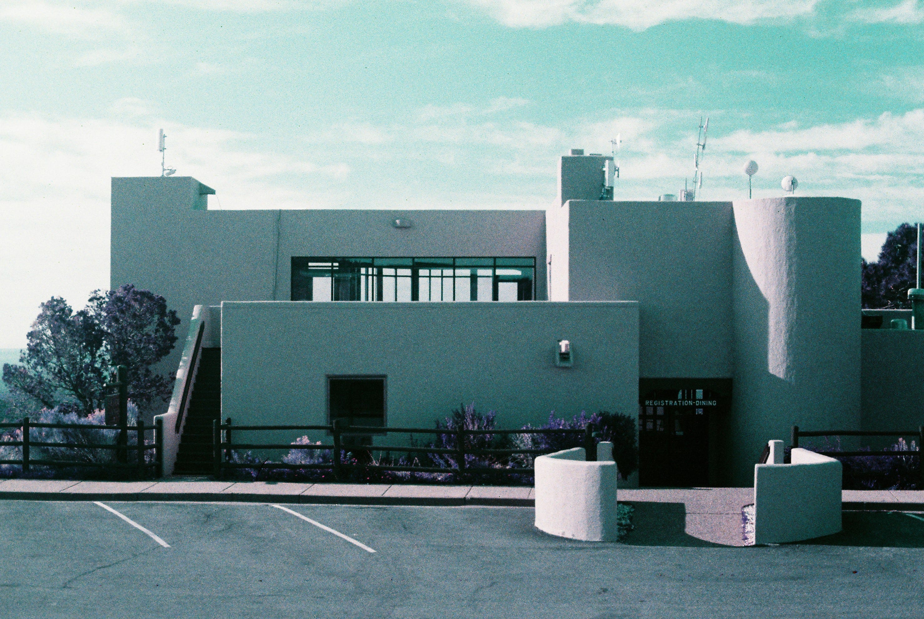
The turquoise sky is a beautiful touch. (Not using my polarizer filter properly came back to bite me a few times.)
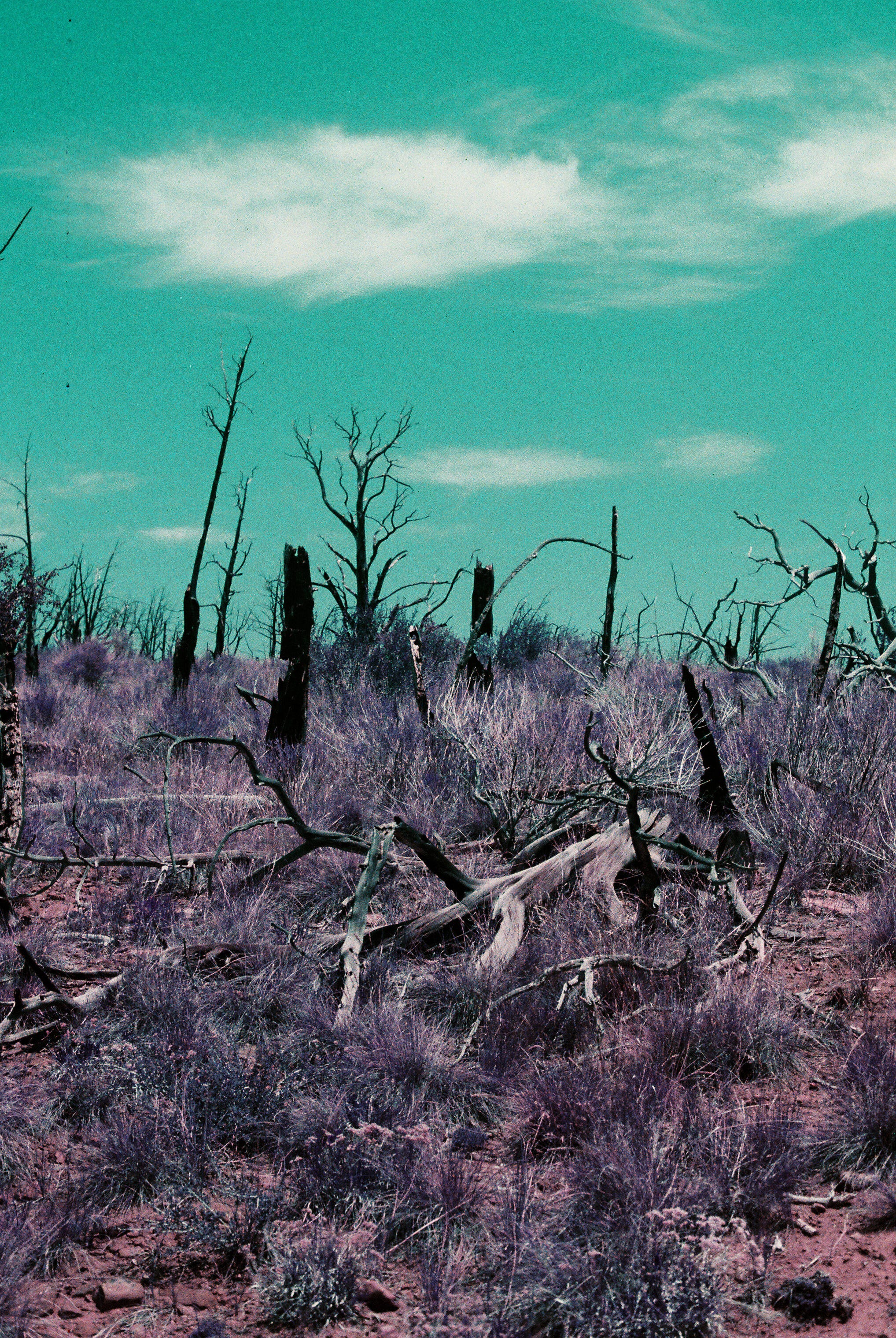
The shift from green to purple makes the grasses and trees look otherworldly (in a good way). I’d like to try this again somewhere a little more lush.
What I didn’t care for:
The ruins were just okay for me. A little too much pastel pink. That’s a subject matter issue on my part.
Overall:
I would be willing to give LomoChrome Purple another try in a different setting. It could be interesting in an urban environment or on a sunny day somewhere a bit greener.
What do you think? Have you used this film stock? Should I give it another try?